How to Add a Feedback Button to Your Website (Code or Widget)
Two ways to put a feedback button on a website. A complete HTML, CSS and JavaScript version, then widget installation guides for WordPress, Shopify, Next.js and more.

TL;DR#
There are two honest ways to add a feedback button to a website, and the right one depends on who is clicking it.
- Build it yourself. About forty lines of HTML, CSS and JavaScript using the native
dialogelement gives you a floating button, an accessible form, and a POST to your own endpoint. Full code below. It takes ten minutes and costs nothing. - Drop in a widget. One script tag from a feedback tool gives you the button plus the things the DIY version cannot do on its own, such as screenshots, the exact element the person clicked, browser and viewport details, and routing into Slack or Jira.
The split that actually matters is not code versus no code. It is anonymous visitors versus people you are working with. A public "was this page helpful" button on a docs site is a form problem, and the DIY version handles it well. Review rounds with a client, a QA pass on staging, or copy checks before a launch are a context problem, and a plain text box loses most of that context before it reaches you.
The rest of this post is both versions in full, then placement, mobile, accessibility, staging-only display, and where the feedback should go after someone clicks send.
What a feedback button is, and what it is not#
A feedback button is a persistent control, usually pinned to a corner of the viewport, that opens a small form where a visitor can tell you something about the page they are on. It stays out of the way until someone needs it, which is the whole difference between a button and a popup survey.
It is not a review section. Reviews and testimonials are public content you display. Feedback is private input you collect. People search for both with similar words, so it is worth being clear about which one you are building before you touch code.
It is also not a survey. A survey asks a fixed set of questions on your schedule. A feedback button waits for the visitor to have something to say. If you want a satisfaction score on every page, you want a survey tool. If you want to know that the pricing table overlaps the footer on a 390 pixel screen, you want a feedback button that captures the page, and ideally the screen, at the moment the person noticed.
Option A, build the feedback button yourself#
This version uses the native dialog element, which gives you a focus trap, Escape to close, and a backdrop without any library. It works in every current browser.
The HTML#
Put this just before the closing body tag.
<button
  id="fb-open"
  class="fb-btn"
  type="button"
  aria-haspopup="dialog"
  aria-controls="fb-dialog"
>
  Feedback
</button>

<dialog id="fb-dialog" class="fb-dialog" aria-labelledby="fb-title">
  <form id="fb-form" method="dialog" novalidate>
    <h2 id="fb-title">Send feedback</h2>

    <label for="fb-message">What should we know?</label>
    <textarea id="fb-message" name="message" rows="4" required></textarea>

    <label for="fb-email">Email, if you want a reply</label>
    <input id="fb-email" name="email" type="email" autocomplete="email" />

    <!-- Honeypot. Real people never see or fill this. -->
    <input
      name="website"
      tabindex="-1"
      autocomplete="off"
      class="fb-honeypot"
      aria-hidden="true"
    />

    <div class="fb-actions">
      <button type="button" id="fb-cancel">Cancel</button>
      <button type="submit" id="fb-send">Send</button>
    </div>

    <p id="fb-status" role="status" aria-live="polite"></p>
  </form>
</dialog>
The CSS#
.fb-btn {
  position: fixed;
  right: max(16px, env(safe-area-inset-right));
  bottom: max(16px, env(safe-area-inset-bottom));
  z-index: 2147483000;
  min-height: 44px;
  padding: 0 18px;
  border: 0;
  border-radius: 999px;
  background: #111;
  color: #fff;
  font: 600 15px/44px system-ui, sans-serif;
  cursor: pointer;
  box-shadow: 0 8px 24px rgba(0, 0, 0, 0.18);
}

.fb-dialog {
  width: min(92vw, 420px);
  padding: 24px;
  border: 0;
  border-radius: 16px;
  box-shadow: 0 24px 64px rgba(0, 0, 0, 0.24);
}

.fb-dialog::backdrop {
  background: rgba(0, 0, 0, 0.35);
}

.fb-dialog label {
  display: block;
  margin: 16px 0 6px;
  font: 500 14px system-ui, sans-serif;
}

.fb-dialog textarea,
.fb-dialog input[type="email"] {
  width: 100%;
  padding: 10px 12px;
  border: 1px solid #d4d4d4;
  border-radius: 8px;
  font: 15px system-ui, sans-serif;
}

.fb-honeypot {
  position: absolute;
  left: -9999px;
  width: 1px;
  height: 1px;
  opacity: 0;
}

.fb-actions {
  display: flex;
  justify-content: flex-end;
  gap: 8px;
  margin-top: 20px;
}

@media (prefers-reduced-motion: no-preference) {
  .fb-btn {
    transition: transform 120ms ease;
  }
  .fb-btn:hover {
    transform: translateY(-1px);
  }
}
The env(safe-area-inset-*) values keep the button above the home indicator on iPhones. The 44 pixel minimum height is the smallest comfortable tap target. The very large z-index is deliberate, because a feedback button that hides behind a cookie banner is a feedback button nobody uses.
The JavaScript#
const openBtn = document.getElementById("fb-open");
const dialog = document.getElementById("fb-dialog");
const form = document.getElementById("fb-form");
const status = document.getElementById("fb-status");

openBtn.addEventListener("click", () => {
  dialog.showModal();
  document.getElementById("fb-message").focus();
});

document.getElementById("fb-cancel").addEventListener("click", () => {
  dialog.close();
});

form.addEventListener("submit", async (event) => {
  event.preventDefault();

  const data = Object.fromEntries(new FormData(form).entries());
  if (data.website) return; // honeypot was filled, quietly drop it
  if (!data.message?.trim()) {
    status.textContent = "Please write something first.";
    return;
  }

  const payload = {
    message: data.message.trim(),
    email: data.email || null,
    url: location.href,
    userAgent: navigator.userAgent,
    viewport: `${innerWidth}x${innerHeight}`,
    sentAt: new Date().toISOString(),
  };

  status.textContent = "Sending...";
  document.getElementById("fb-send").disabled = true;

  try {
    const res = await fetch("/api/feedback", {
      method: "POST",
      headers: { "Content-Type": "application/json" },
      body: JSON.stringify(payload),
    });
    if (!res.ok) throw new Error(`HTTP ${res.status}`);
    status.textContent = "Thanks, got it.";
    form.reset();
    setTimeout(() => dialog.close(), 900);
  } catch (err) {
    status.textContent = "Could not send. Please try again.";
  } finally {
    document.getElementById("fb-send").disabled = false;
  }
});
Because the form uses method="dialog" but we call preventDefault, the dialog only closes when we say so, after the request succeeds. Focus returns to the button automatically when the dialog closes, which is the accessible behaviour you want and which most hand-rolled overlays get wrong.
The endpoint#
Never post from the browser straight to a Slack webhook. Slack does not send CORS headers, and you would be publishing your webhook URL to anyone who opens dev tools. Ten lines on the server fixes both. Here it is as a Next.js route handler, and the shape is identical in Express or a serverless function.
// app/api/feedback/route.js
export async function POST(request) {
  const body = await request.json();
  if (!body?.message || body.message.length > 2000) {
    return new Response("Bad request", { status: 400 });
  }

  const text = [
    `New feedback on ${body.url}`,
    body.message,
    `From ${body.email || "anonymous"}, ${body.viewport}, ${body.userAgent}`,
  ].join("\n");

  await fetch(process.env.SLACK_WEBHOOK_URL, {
    method: "POST",
    headers: { "Content-Type": "application/json" },
    body: JSON.stringify({ text }),
  });

  return new Response(null, { status: 204 });
}
Add a rate limit before you ship it. Even a simple in-memory counter per IP stops the one bored person who discovers your endpoint at two in the morning.
That is a complete, accessible, mobile-safe feedback button. If your job is collecting "this page was confusing" notes from anonymous visitors, you can stop here.
What the DIY version cannot tell you#
I want to be precise here, because this is where most people decide they need a tool, and I would rather you decide it on facts.
- Which element they meant. The payload has the page URL. It does not have the button, the image, or the paragraph the person was looking at. "The link is broken" on a page with forty links is a search, not a bug report.
- What the screen looked like. Browsers cannot take a screenshot silently.
getDisplayMediashows a permission prompt and a picker, which most visitors cancel. The alternative is serialising the DOM and re-rendering it, which is a real engineering project once you hit cross-origin images, web fonts, canvas, and fixed elements. Every visual feedback tool spends most of its effort right there. - What the browser saw. Console errors, failed network requests, and the state of a JavaScript app at the moment of the report all evaporate the second the dialog closes.
- Who sent it. An email field is optional and usually empty. In a client review round you need to know it was the client, not their intern, and you need their second comment to sit next to their first.
- What happened next. There is no status, no assignee, no "done". A Slack channel of feedback messages becomes unreadable after the first week of a real project.
- Whether it is a duplicate. Five people reporting the same broken image create five messages, because nobody can see that it has already been reported.
None of these are flaws in the code above. They are the reasons the code above is a form, and a form is the right tool for one of the two jobs.
Option B, add a feedback button with a widget#
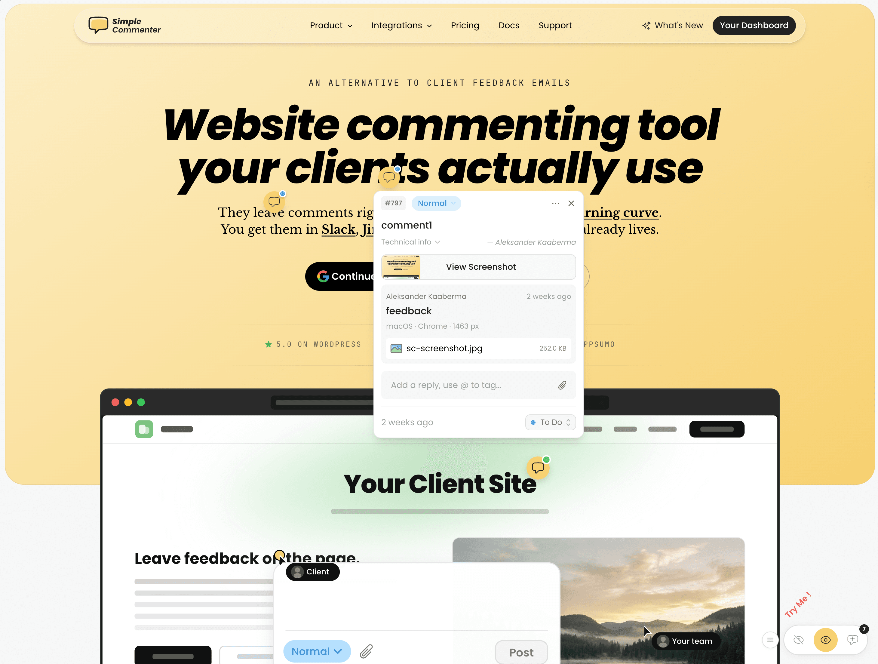
A feedback widget is the same button, delivered by a script tag, with the missing pieces handled for you. The person clicks the button, then clicks the thing on the page they mean, and types. The tool captures the element, a screenshot, the URL, browser, operating system, and viewport, and files it somewhere your team will see it.
Full disclosure, I run Simple Commenter, which is one of these. The snippets below use it because those are the ones I can vouch for, but every widget in this category installs the same way, with its own script URL and key. Swap the tag and the steps do not change.
The base tag is one line. It goes in the head or right before the closing body tag, either works.
<script
  src="https://simplecommenter.com/js/comments.min.js"
  data-id="sc_your_project_key"
  defer
></script>
One detail that matters for performance. That file is a small loader of a few kilobytes. The full widget only downloads for visitors who are actually allowed to see it, such as invited reviewers, so your public visitors and your Core Web Vitals never pay for it.
WordPress#
Install the Insert Headers and Footers plugin, open its settings, and paste the tag in the Footer box. This survives theme updates, which editing footer.php does not. If you prefer a child theme, hook it into wp_footer.
function add_feedback_button() {
  ?>
  <script
    src="https://simplecommenter.com/js/comments.min.js"
    data-id="sc_your_project_key"
    defer
  ></script>
  <?php
}
add_action("wp_footer", "add_feedback_button");
Shopify#
Install Simple Commenter from the Shopify App Store, then open Apps > Simple Commenter in Shopify admin. Sign in and connect the project for your store. In the app's setup wizard, click Open theme editor, enable Simple Commenter under App embeds, and click Save. Open your review link and leave a test comment; it appears under Feedback in Shopify admin. The app embed works on storefront theme pages, not Shopify checkout. Follow the Shopify installation guide for the complete setup.
Squarespace#
Settings, Advanced, Code Injection, and paste the tag into the Footer field. Business plan or higher is required for code injection.
Webflow#
Project Settings, Custom Code, paste into Footer Code, save, and publish. Publishing is the step people forget.
Wix#
Settings, Custom Code, Add Custom Code, paste the tag, set placement to Body end and apply to all pages. Wix requires a Premium plan for custom code.
Next.js#
Use the Script component in your root layout so it loads once and never blocks rendering.
import Script from "next/script";

export default function RootLayout({ children }) {
  return (
    <html lang="en">
      <body>
        {children}
        <Script
          src="https://simplecommenter.com/js/comments.min.js"
          data-id="sc_your_project_key"
          strategy="lazyOnload"
        />
      </body>
    </html>
  );
}
React, Vue, or any single-page app#
Append the script once when the app mounts and remove it on unmount, otherwise hot reloading in development will inject it twice.
import { useEffect } from "react";

export function FeedbackButton() {
  useEffect(() => {
    const script = document.createElement("script");
    script.src = "https://simplecommenter.com/js/comments.min.js";
    script.dataset.id = "sc_your_project_key";
    script.defer = true;
    document.body.appendChild(script);
    return () => script.remove();
  }, []);

  return null;
}
Google Tag Manager#
Create a Custom HTML tag with the script, trigger it on All Pages, and publish the container. This is the route when you cannot touch the site's code at all, and it is also the easiest one to remove later.
Where to put the feedback button#
Bottom right is the default for a reason. It is where people expect a persistent control, and it stays clear of the main content on nearly every layout. Three cases break that default.
- You already have a chat widget there. Two floating buttons in one corner is the most common feedback button mistake. Move feedback to the bottom left, or to a tab on the right edge halfway down the viewport.
- Your site has a sticky bottom bar on mobile. Cookie banners, app install bars, and mobile navigation all live at the bottom. If yours does, the button needs to sit above the bar, and the safe-area CSS above is not enough on its own.
- The feedback is for reviewers, not visitors. If only your client or your team will click it, a visible button on production is noise for everyone else. That is what the next section is for.
On mobile, the thumb zone is the bottom third of the screen, and the bottom right corner is the easiest reach for a right-handed user. That is the argument for keeping it there. The argument against is that it also covers the corner where a lot of forms put their submit button. Test on a real phone with your real pages before you decide.
Showing the button only on staging#
Most review work happens before launch, on a preview deploy or a staging server, and there is no reason for the public to see a feedback button on the production site.
With the DIY version, wrap the whole thing in a hostname check.
const isReviewHost =
  location.hostname.startsWith("staging.") ||
  location.hostname.endsWith(".vercel.app") ||
  location.hostname === "localhost";

if (isReviewHost) {
  // inject the button and dialog here
}
With a widget, you usually do not need to gate the button at all, because gating the people is better. Set the project to invite only and the button simply does not render for anyone who is not on the list, on staging and production alike. The same script tag then works on a password-protected staging server, on a preview URL, and on the live site, without three different snippets to maintain.
Where the feedback should go after send#
A feedback button that ends in an inbox is a feedback button that gets ignored by week two. Decide the destination before you decide the design.
- A Slack or Teams channel is the right destination for low volume public feedback. The endpoint above already does this.
- Your issue tracker is the right destination for anything a developer will fix. The useful payload is the URL, the element, a screenshot, the browser and viewport, and the reporter. If your button cannot supply those, the developer will ask for them one message at a time.
- A board with statuses is the right destination for client review rounds, because the client needs to see what has been addressed without asking.
Simple Commenter pushes each comment into Slack, Jira, Linear, Trello, Asana, ClickUp, Monday, GitHub, or a webhook with that full payload attached. The integrations page lists what syncs where. Other widgets in the category do a subset of the same list, so check the one you are considering against the tracker you actually use.
DIY, survey tab, or visual feedback widget#
| Build it yourself | Survey or feedback tab tool | Visual feedback widget | |
|---|---|---|---|
| Setup time | 10 to 20 minutes | 5 minutes | 5 minutes |
| Cost | Free | Usually free tier, then per response | Usually free tier, then per project |
| Captures the element clicked | No | No | Yes |
| Captures a screenshot | No | Sometimes | Yes |
| Browser, OS and viewport | If you add it | Usually | Yes |
| Reporter identity | Optional email | Optional | Named reviewers, no signup |
| Works on staging and password-protected sites | Yes | Sometimes | Yes |
| Statuses and assignment | No | Rarely | Yes |
| Best for | Anonymous "was this helpful" input | Satisfaction scores and NPS | Client review, QA, launch checks |
If you are not sure which column you are in, the free website feedback tool lets you drop pinned comments on any URL without an account, which is a fast way to feel the difference between a comment attached to an element and a comment attached to a page.
Frequently asked questions#
How do I create a feedback button in HTML?#
Use a button element fixed to a corner with CSS, a dialog element containing a form, and a few lines of JavaScript that call showModal() on click and fetch() on submit. The complete version is in the Option A section above and needs no library.
Where should a feedback button go on a website?#
Bottom right, unless a chat widget is already there, in which case bottom left or a right-edge tab. On mobile keep it above any sticky bottom bar and respect the safe-area insets so it does not sit under the home indicator.
Is a feedback button the same as a review section?#
No. A review section displays public testimonials. A feedback button collects private input about the page. If you want visitors to post public reviews, you want a reviews or comments plugin, not a feedback button.
Should the feedback button show on mobile?#
Yes, if visitors report problems from phones, which on most sites is more than half of them. Keep the tap target at least 44 pixels tall and test that the dialog is usable with the keyboard open.
Can I show the feedback button only on staging?#
Yes. With your own code, check location.hostname before injecting the button. With a widget, set the project to invite only so the button renders only for people you have added, on every environment.
What information should a feedback button capture?#
At minimum the message, page URL, browser, and viewport size. For anything a developer will fix, also the element that was clicked, a screenshot, and who reported it. The first list is a form. The second list is why feedback widgets exist.
Found this useful? Add us as a preferred source and Google will show you more of our guides in Search and AI Overviews.